Acutest
Brand design and implementation
Illustration
Acutest are a London based IT testing company with an impressive client list. Origin8 have worked with the company for many years and have rebranded the business for a second time.
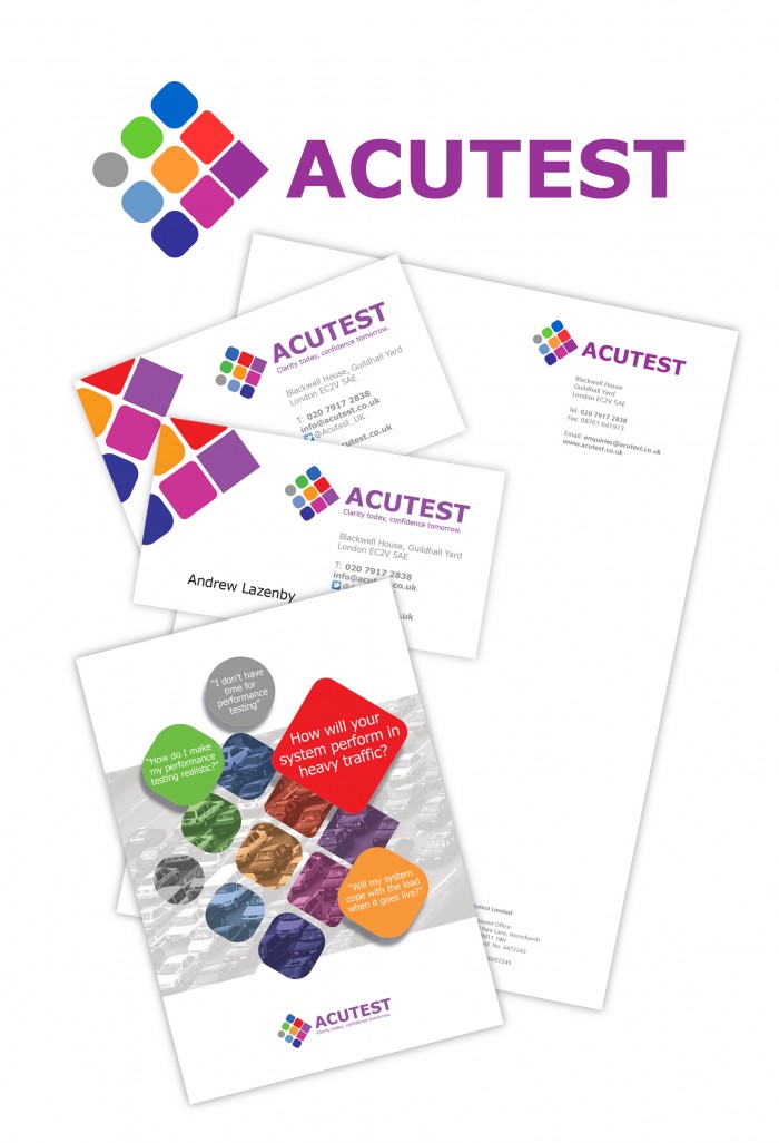
It was important to evolve the brand so using the layout of the previous logo, the nine ‘business sectors’ were given shape and colour to enhance the image of growing the client’s IT efficiency. Each colour and shape represent a service supplied by Acutest so that a consistent graphic message follows through literature and web communications.
The example shows the identity, stationery layouts and a brochure cover. The website will follow this simple but strong image and create a dynamic navigation for the client.


